Monday 8 June 2009

Free Range

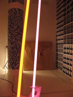
Here are some photos of the finished installation exhibited as a part of Free Range.


Sunday 17 May 2009

Lastminute.com


Just ordered my book from blurb but panicked when saw the delivery dispatch date. Hope it get's here on time...

Saturday 16 May 2009

Print Proposal

Here is my suggestion for prints to accompany my monolithic sculptures:

Gallery proposal

Here is my suggested layout for the installation:


Tuesday 12 May 2009

Cuban poster art

Looking through books on my shelves I wanted include this as influence because I love they way they are designed. Cuban poster art from the 1960s through to the 1980s was heavily dominated in promoting various political/social themes and as a way to create national pride. They were specific to their audience, a semi literate country, were easily manufactured and distributed and encouraged the arts. They have had an influence purely in the way they look: colour, composition, type etc but they also interest me because on the one hand it could be argued that they act in the same way as JMB child safety posters as a social tool or it could be that they are opposite by using manipulative means to control a nation and divert thinking.


Why Not Associates

I then started looking at the work of the Why Not Associates because of the dominance in their work of strong typography. I was reading their section in "Contempory Graphic Design" and they write that the common theme in all their work is typography. Below I've included a photo of some stills from a project they did called Nike Heroes and it's so slow moving which gives even more stregth to the how the type wants to be emphasised. I've tried to trace some sort of lineage between 1950s/Swiss expression of moderism and more recent examples and I think Why Nots can be included within this because although some of their work looks nothing like JMB or uses helvetica they have obviously been heavily influenced by the the work and I thought their section in the "Contemp..." explained a similar process to chosing clients that JMB followed.


Here is the link to their site with the film, sorry couldn't embed it.

Experimental Jetset

After looking at JMB and the Helvetica documetary I wanted to look at designers still using helvetica but in a different way, with different reasons and 50 years on from when JMB started so I chose Experimental Jetset. Below is their section from the Helvetica film explaining their approach to the typeface but I was more interested in their reasons behind why they still used helvetica as an important aspect within their visual language and their take on modernism:

Josef Muller-Brockmann

JMB is my favourite designer ever. I love the level of intellectualisation he gave design with grids and why space was so important, his approach to interpretating music in his work for the Zurich Tonhalle posters, how clean everything is asthetically and his use of type.
Here is an animation of some of his work (not done by me):

Drink Coke. Period.

Realised I hadnt put too much up that wasn't either bikes< scuplture or me moaning about plaster of paris so hereis some stuff I've been looking at that has had a big influence on my designs:


I've rewatched this documentary to give an understanding of the development of modernism, why san serifs were used and why some people hate them. This modernist/Swiss style has has influenced the designs because I wanted some of them really clean and the type to be legible and for it suggest a bit more than the images were offering. Whilst at the same time understanding why grids, space and certain typefaces were used.

Wednesday 6 May 2009

Test Installation

I tested the first slab in the FEED vs tDR FEED seminar and I'm really pleased with the results. The accomanying work is by Martin Wilkie.


Tuesday 5 May 2009

Bicycle v3

This is the version of the two previous animations pieced together with all the different designs I've done in an all out mind assault and letting it linger on just a few images teasing you with them before they disappear again.

Bicycles

Sunday 3 May 2009

Circuit Images 3

Here are some more but this time block colour


Circuit Images 2

Here are some more


Circuit images

I had been thinking about the more abstract images I had done previously to try and show movement and encapsulate different aspects of cycling and not getting very far. Then on a train I picked up someone's discarded copy of The Times magazine and was flicking through when I saw the image below and thought it was beautiful. I thought it looked ace already but thought I could do something with it and the idea of a track/overtaking and tactics involved with track cycling. To convey the movement and speed and weaving in and around other cyclists.

These are my first attempts and I'm really pleased with them.


Saturday 2 May 2009

Pain

I'm trying to upload some new images/designs I've done and every time I'm trying to upload them blogger is messing the contrast up.

Hopefully I'll work thi out soon.

Gareth

Monday 27 April 2009

The wheel goes in pt.2

After the mixing the wheel went in...


Sunday 26 April 2009

Kayne Jackson to the rescue!

So on seeing my desperation my friend Kayne comes to my aid and in the nicest way tells me I'm using the wrong sort of plaster, I'm mixing it in the wrong way and that there's no way I've bought enough plaster to make one of my slabs let alone four. I panic even more. What am I going to do then? Kayne tells me not worry and he"ll give me a hand tomorrow. What?! What a mate.
So the next day me and Kayne go down a builders yard round the corner from the FEED studio and get three bags of the right sort of plaster (bonding plaster) at a third of the price of the plaster of paris. Not only does Kayne tell what we need he brings a mixing bucket, a drill and the mixing bit for the drill! What a mate.
So three hours and a whole lot of dust and splashes later Kayne has helped me (or as you can see from the photos done it pretty much for me) and we are filling the frame full of lovely mixed bonding plaster!

This makes me the happiest I've been in a fortnight.


So... it went wrong, again.

So I had almost (but not completely) given up on the slab in my back garden because it just wasnt getting any dryer. It got to the point with it that I was soaking water off the top of it and everytime I did this more water would appear. I'm pretty sure it will never dry out.
So I thought I would give it another go but this time in the FEED studio where the rain wouldn't get to it and it would be all round dryer. With the help of my friend Imi we dragged all the plaster and wood in the studio to give it another go. This time I thought it would work better if instead of putting the plaster into the water if I out the water into the plaster and do it a batch at a tme and pour it into the second frame in college. "A plan without any drawbacks!" I thought...
So the fame and tarpaulin are in place ans I start mixing the plaster. I feel so good I've got it all under control and the first mix is spot on. The right consistancy and just how it should be. Not like the stupid one in my back garden?!? I pour it out in the mold and I start on the next batch. Disaster strikes. This batch isnt going as well and is going off in the washing up bowl I'm mixing this in!? (The first picture below) I keep trying with it for a bit and it's just getting worse and worse. Then another friend Kayne comes round to see what's going on and fiends me stressing about how nothing is going right and sees the solid lump of plaster (pictures 2 and 3 below) sat in the frame and, in the nicest possible way, tells me this isn't going to work...

I'm losing faith that this will ever work at this point.